When developing with Cocos Creator, you will most likely build your own components for your nodes. The great thing about components in our editor is that you can quickly edit properties and test them rather than running back into the code to edit everything. The Inspector panel has a lot of different properties that you can use. Here are a few examples:
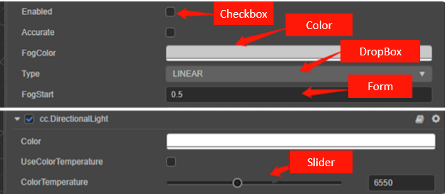
You have probably seen most of these in other pre-built components we've already built in the game engine. So how can I get my component to display the same way pre-built ones are in the Inspector panel?

Cainiao from our forums recently used Cocos Creator's decorator to implement different combinations with the Inspector panel. To make a long story short, here's how you can build your own.
TypeScript decorators
First, let's take a look at TypeScript's interpretation of decorators: in some cases, we need additional features to support annotation or modification of classes and their members. Decorators allow us to add annotations to class declarations and members using metaprogramming syntax.
We can extract several key points from the above explanation: Their role is to annotate or modify a class and its members. We can understand that TypeScript has many decorators: class decorators, property decorators, method decorators, and method parameter decorators.
Decorators in Cocos Creator
Since the Cocos Creator 3.x programming language uses TypeScript as its main development language, decorators have become a must-know for everyone. For beginners, you can first understand "Serialization," "Script compilation timing of Cocos Creator," and "Decorator execution timing."
- "Serialization:" By default, the attribute values set in the editor will be saved to resource files such as scenes and then automatically restored to the set attribute values when the scene is loaded.
- "Script compilation timing:" After we modify the project script in the external script editor, returning to Cocos Creator will automatically trigger script compilation.
- "Decorator execution timing": The change of the class's behavior by the decorator occurs when the code is compiled (not TypeScript compilation, but the js compilation phase is in the executor, not at runtime). This means that the decorator can run the code during the compilation phase. In other words, decorators are essentially functions executed at compile time.
Basic usage
Component class decorator (executeInEditMode)
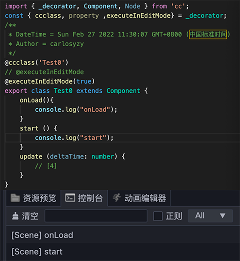
Before we start, all components are usually executed once at runtime, which means that their lifecycle callbacks do not fire in editor mode. If you need to execute them in editor mode, you can use the component class decorator executeinEditMode.
Basic property decorators
For basic inputs like nodes, numbers, words, or checkboxes, you can force these types by using the following calls when calling on the @property:
- CCInteger, CCFloat, CCBoolean, CCString, Node
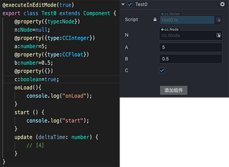
You can also use brackets to create an array. But you must declare if it will be a node, integer, float, boolean, or string type.

Display Name
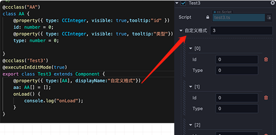
By adding a string to the property type using displayname, you can add a displayed name visible in the editor.
Tool Tips
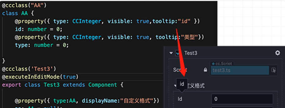
Suppose you are building code for a large number of developers and want them to understand what each item in your custom component does. Add a tooltip just as you would with displayname by adding a string. Now just hover over the property, and your tooltip will appear.
Visibility
Note that not all defined property decorators need to be visible. Some may break the game if the wrong options are available. In the following two cases, we’ll hide some options.
- Option one: When you start the property name starts with _, the visible property will default to false
- Option two. You can also use the visible:false or point to another property to see if it is turned on or off to make it visible or not. (The property must return a Boolean for it to work.)
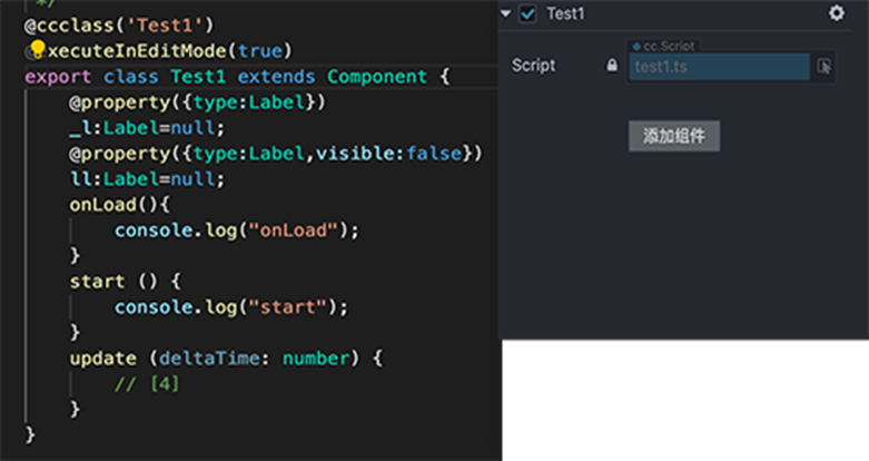

Suppose you want the option to be visible but not able to be changed inside the editor. Use the readonly:true call in the property area.
Drop-down list
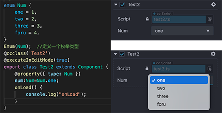
Drop-down lists can be made by creating an enum, making an enum variable before the @ccclass, and then calling on the variable as the property type. Make sure also to choose the default choice calling on the VARIABLE_NAME:ENUM_NAME:ENUM_NAME.CHOICE;
Slider
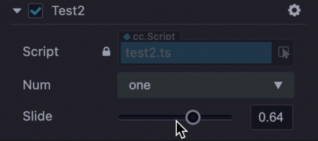
Sliders are a bit more difficult but are not hard to follow. You will need to do the following
- Type: CCFloat or CCInteger
- Slide: true (visible) or false (not visible)
- max: Maximum number
- min: Minimum number
- step: how fast does it go up in numbers when you move the slider
- Slide:number=: where do you want the default number to be. (“number” can be any INT or FLOAT variable you want)

Custom containers
There are two different ways to add containers to your project. Why containers? It can help organize your properties if you have very large components with numerous variables.
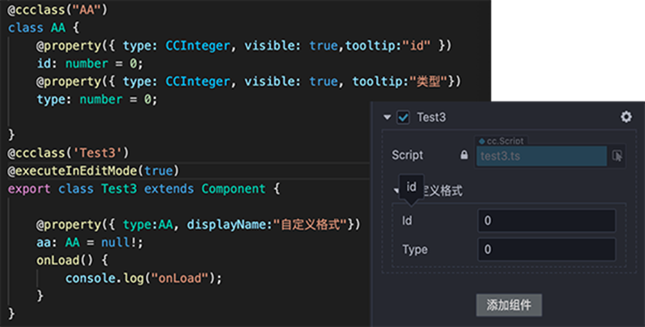
We can call for another @cclass outside the main component with many classes inside that have the properties already built-in for the first way. Then in the called class, call for it as its own property.
Style 1
Style 2
Another way is the same as before, but it is called as an array. This allows for multiple versions of the class to be called.
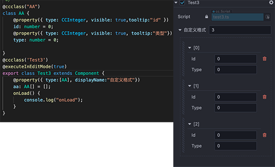
Serializable (serializable)
Attributes are serialized by default. After serialization, the attribute values set in the editor will be saved to resource files such as scenes and then automatically restored to the set attribute values when the scene is loaded. If you don't want to serialize, you can set serializable: false.
@property({ serializable: false })
num = 0;
get/set use
Get and set are also allowed to change the default properties to another option if required.
@property
_num:number=1;
@property({type:CCInteger,tooltip:"提示内容"})
set num(val){
    this._num=val;
}
get num(){
    return this._num;
}
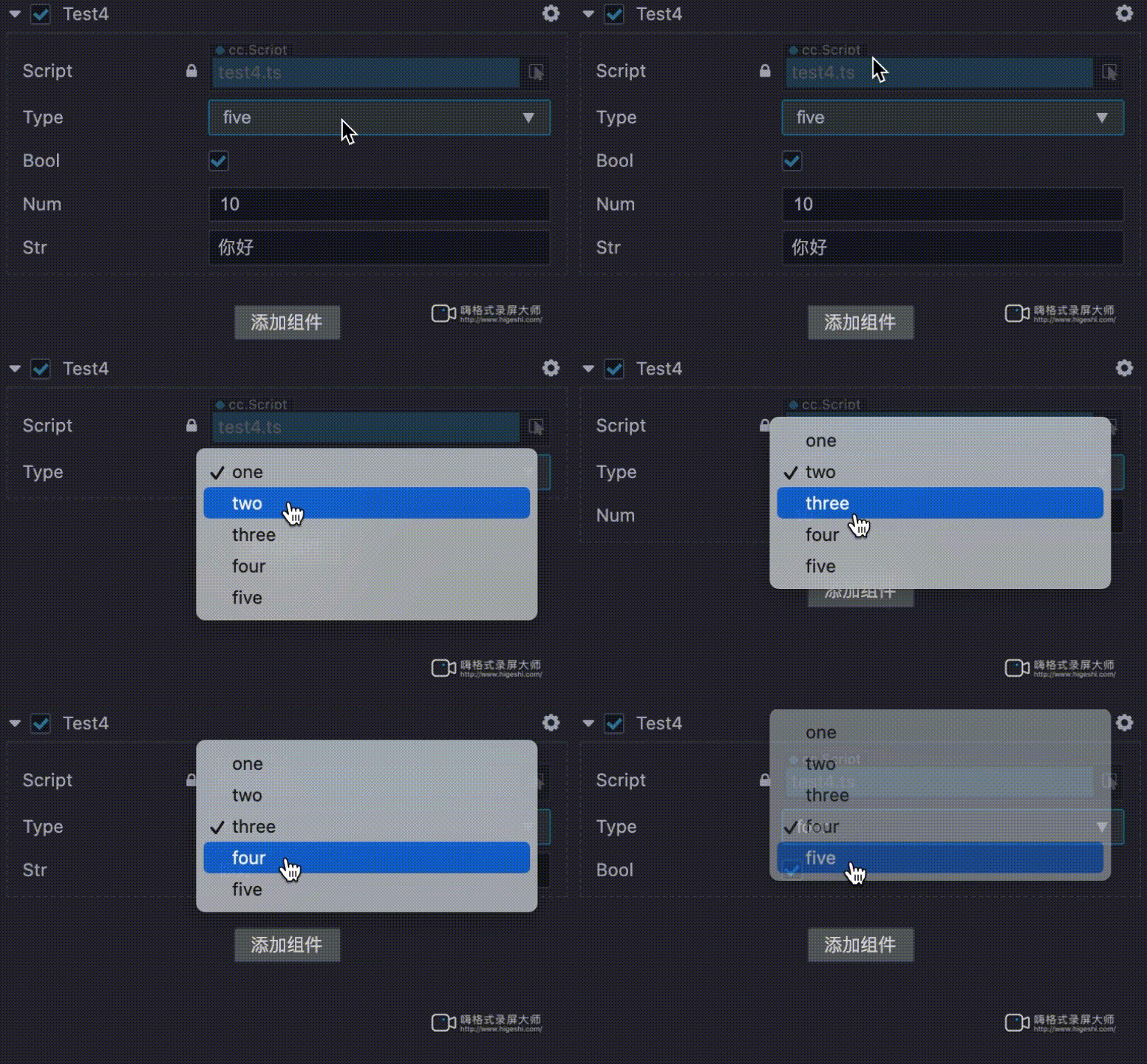
Final Example
 enum Type {
    one = 1,
    two = 2,
    three = 3,
    four = 4,
    five = 5,
}
Enum(Type);

@ccclass('Test4')
@executeInEditMode(true)

export class Test4 extends Component {
    @property
    _type: Type = Type.one;

    @property({ type: Type })
    get type() {
        return this._type;
    }

    set type(val) {
        this._type = val;
        this.setType(val);
    }

    @property
    _num: number = 10;

    @property({
        type: CCInteger, visible: function (this) {
            return this.isShowNum;
        }
    })

    get num() {
        return this._num;
    }

    set num(val) {
        this._num = val;
    }

    @property
    _str: string = "你好";

    @property({
        visible: function (this) {
            return this.isShowString;
        }
    })

    get str() {
        return this._str;
    }

    set str(val) {
        this._str = val;
    }

    @property
    _bool: boolean = true;

    @property({
        visible: function (this) {
            return this.isShowBool;
        }
    })

    get bool() {
        return this._bool;
    }

    set bool(val) {
        this._bool = val;
    }

    private isShowNum = false;
    private isShowString = false;
    private isShowBool = false;
    private setType(val): void {
       ...
    }

    onLoad() {
        console.log("onLoad");
    }
}
Conclusion
Though we shared a lot of different decorations, there are a lot more than you can find out about in our documentation, we hope this excites you to build your own components that will improve your workflow and make your game development easier and simpler.


